Marketing & Print Design in Portsmouth
Branding · Campaign · Posters · Editorial
Marketing and print design, from a single leaflet to a whole branding suite. There’s a photography studio brand in here, a coffee campaign that carries from a poster onto a tote and a travel cup, eight dyslexia awareness posters and a magazine feature laid out cover to closing page.
Babia Studios
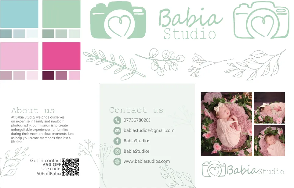
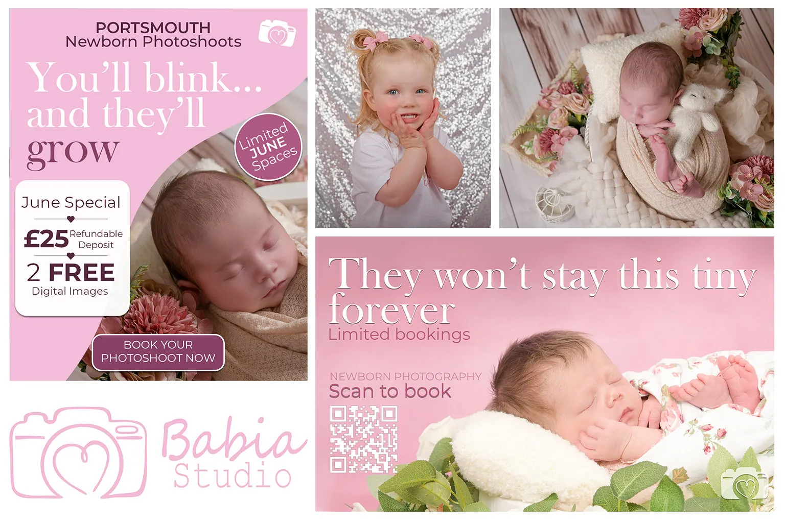
Babia Studios is a newborn and family photography studio. I started with the brand board, which is where the sage-green camera-heart mark, the soft blues and pinks and the botanical line sprigs all got settled, and then built the rest off it.
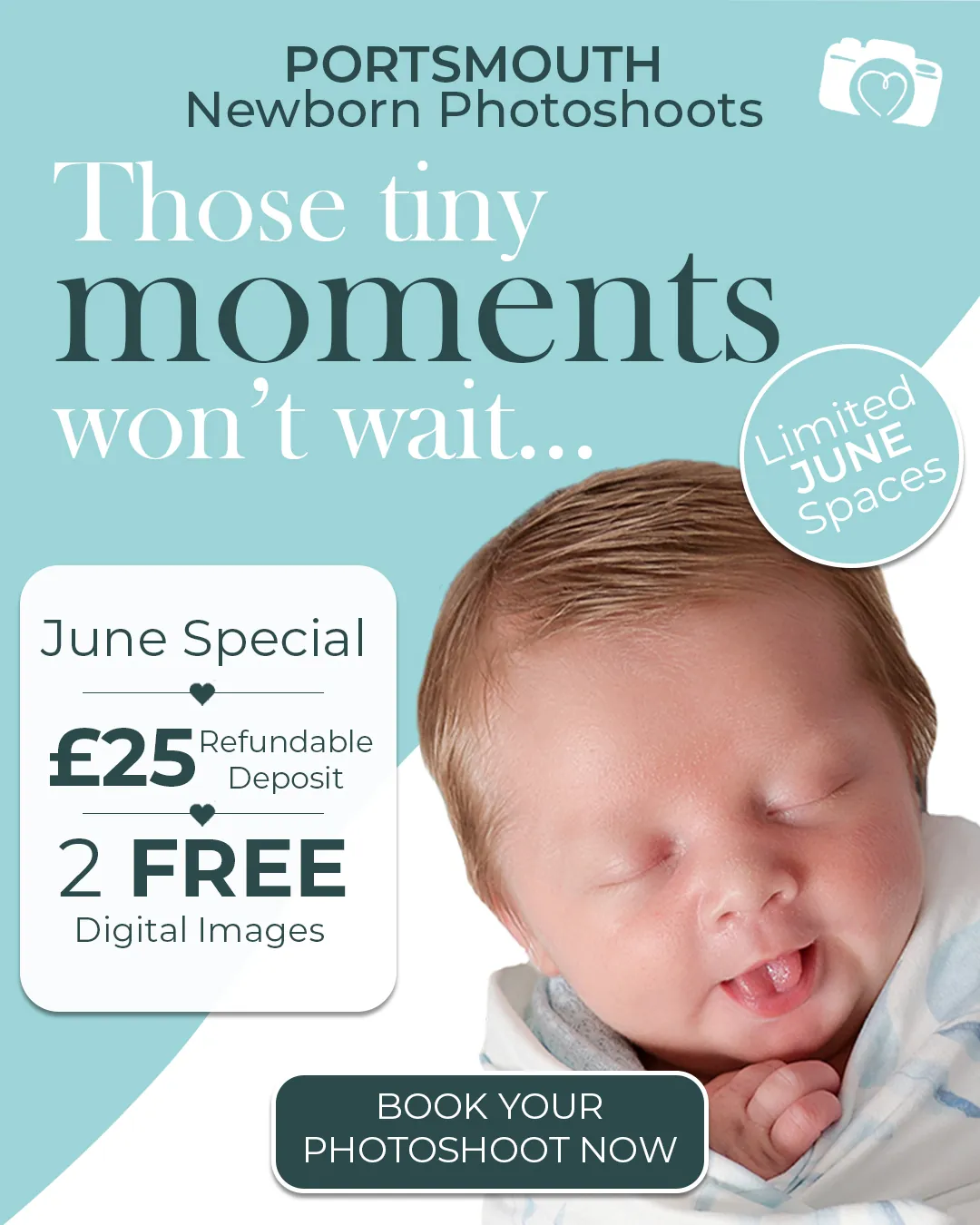
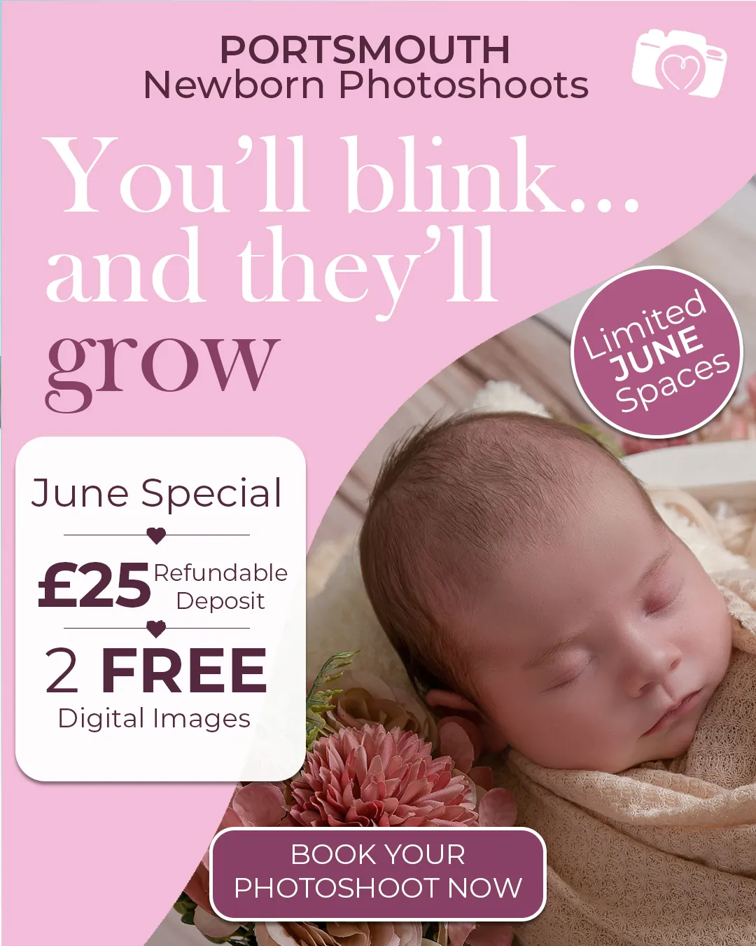
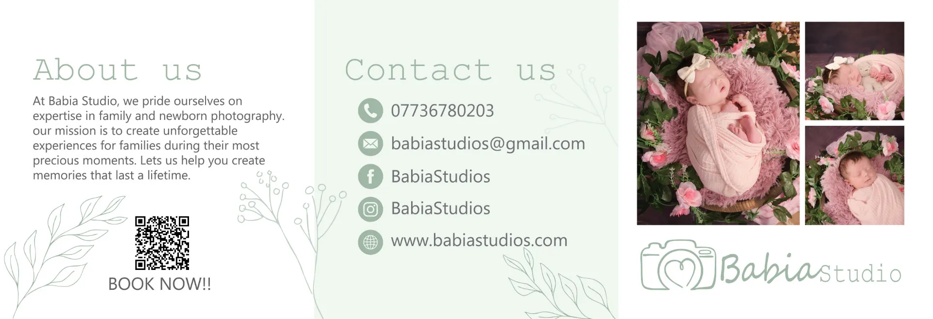
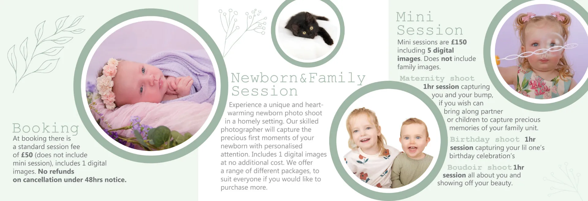
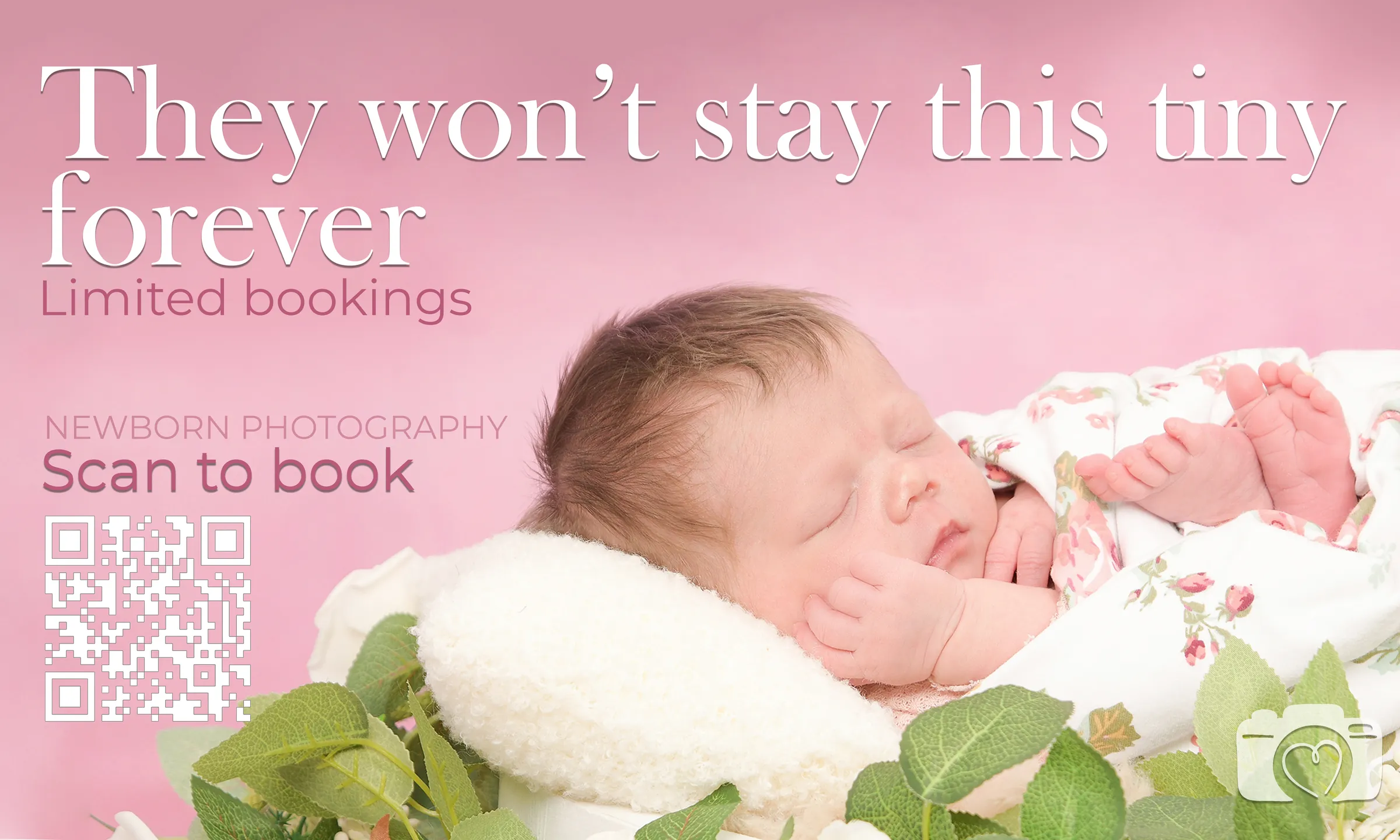
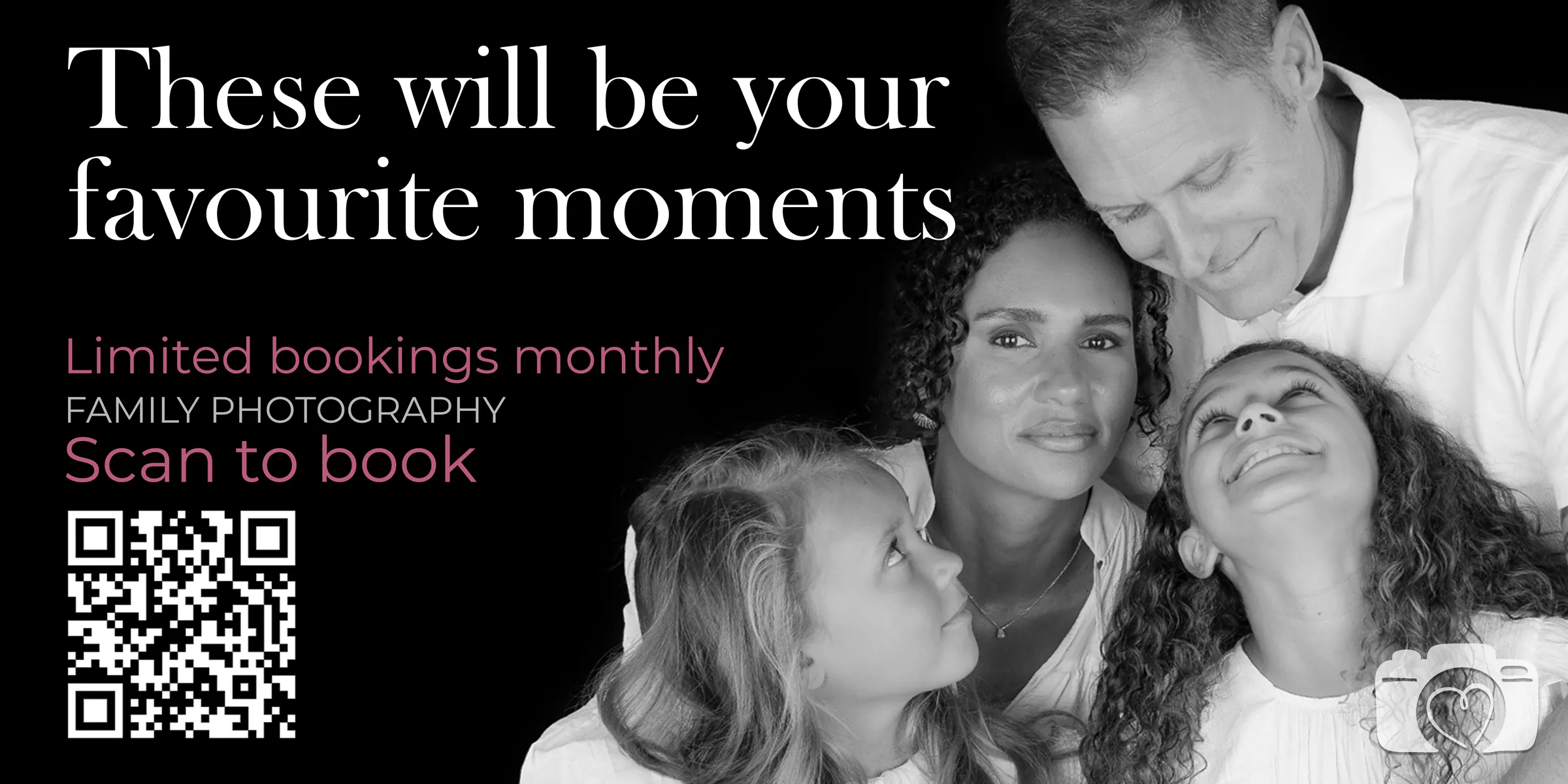
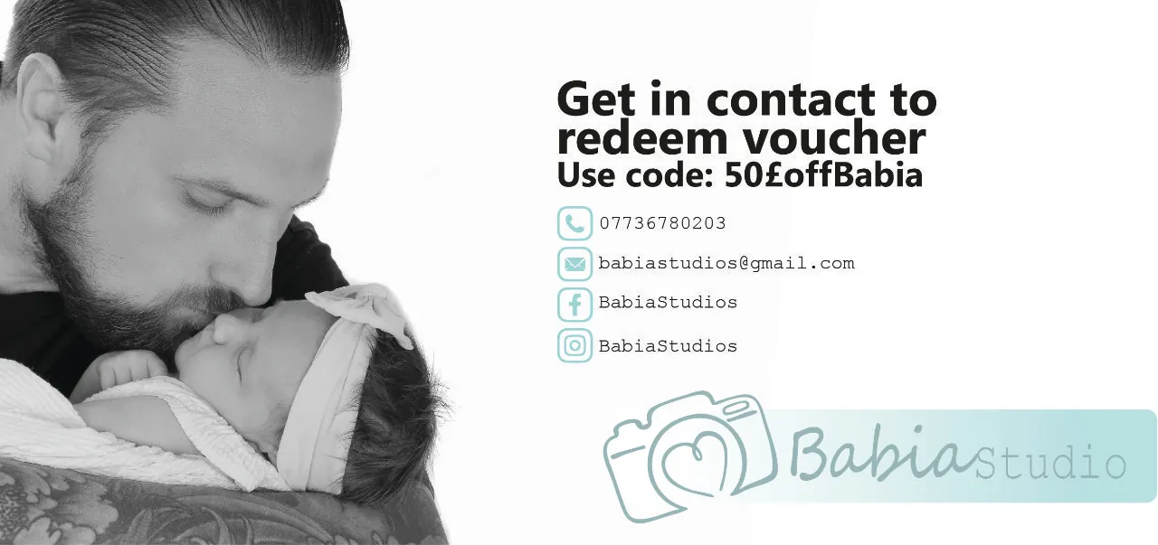
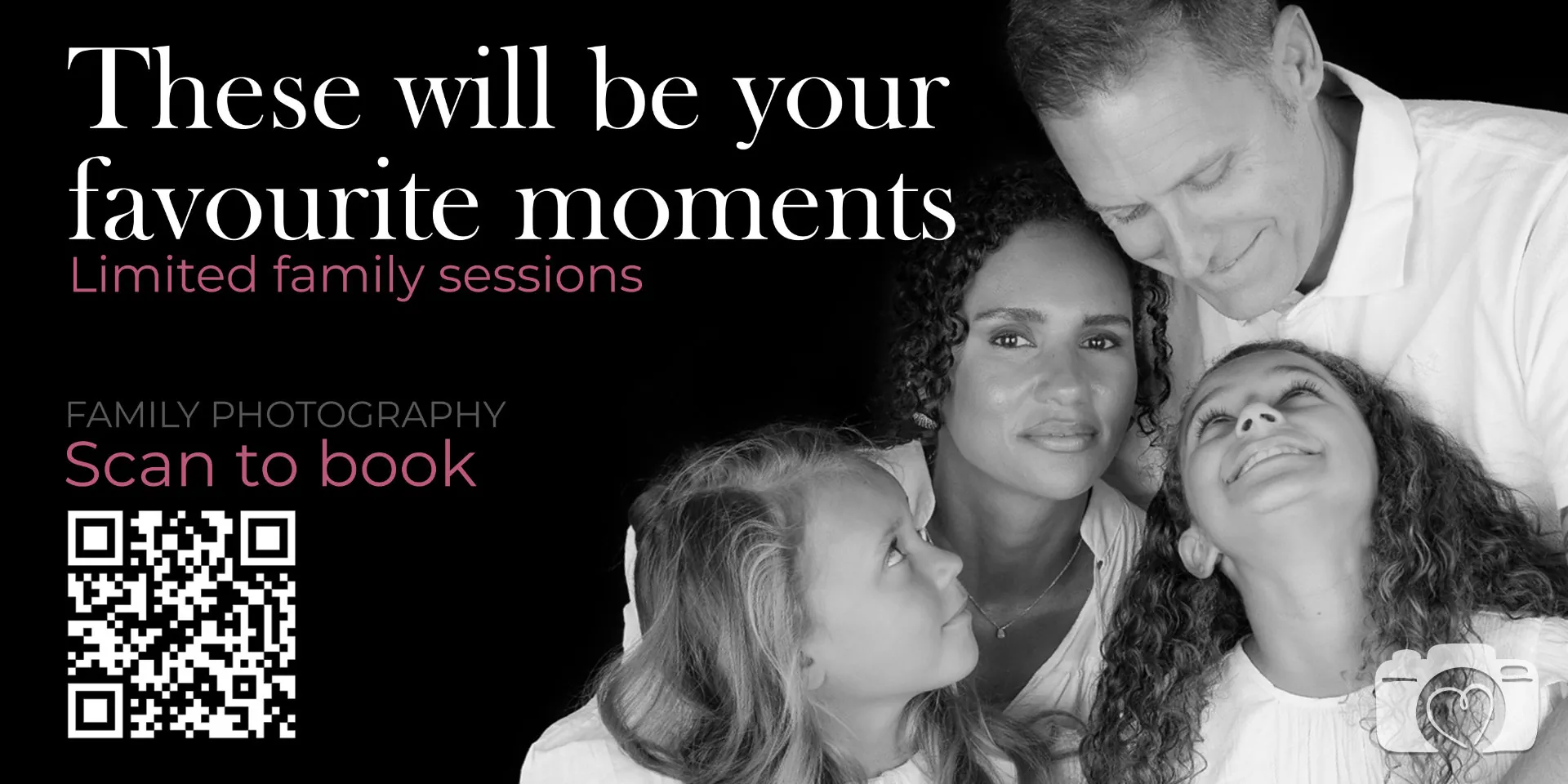
There’s a tri-fold leaflet with a QR code that goes straight to booking, and the earlier version of it with the session types set in green circles. After that came social advert templates in four colourways, wide banners for the booking season, and a landscape voucher card taking fifty pounds off a session.
 View larger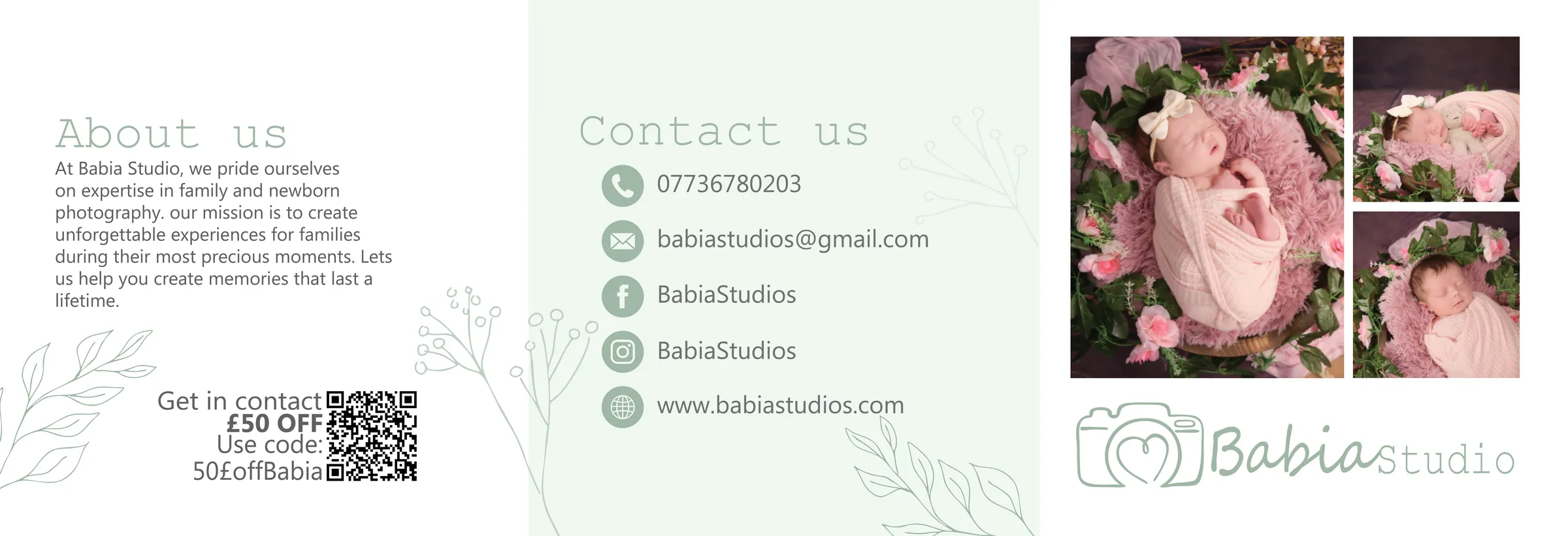





Pact Coffee
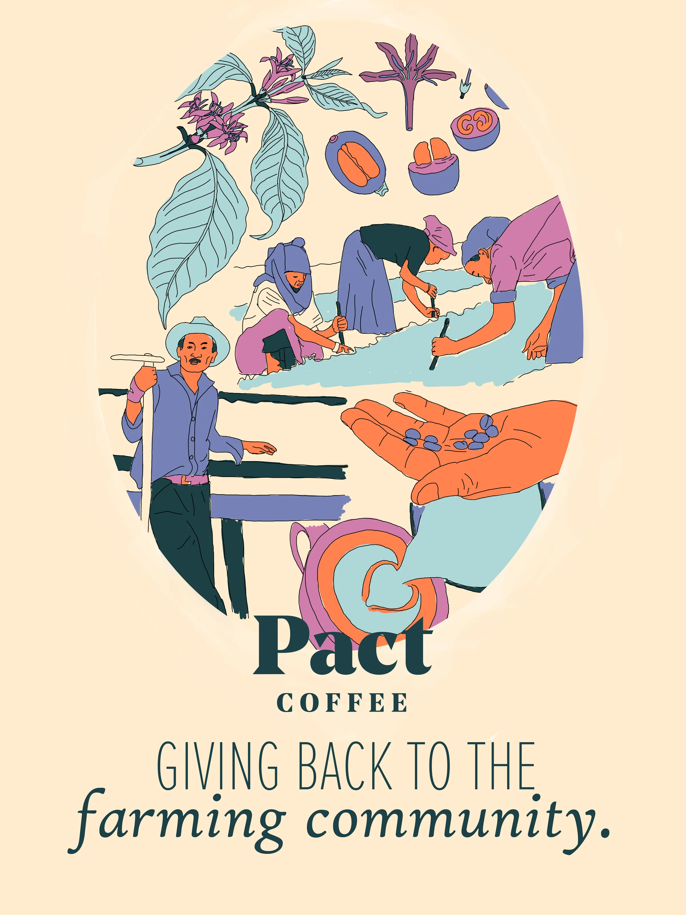
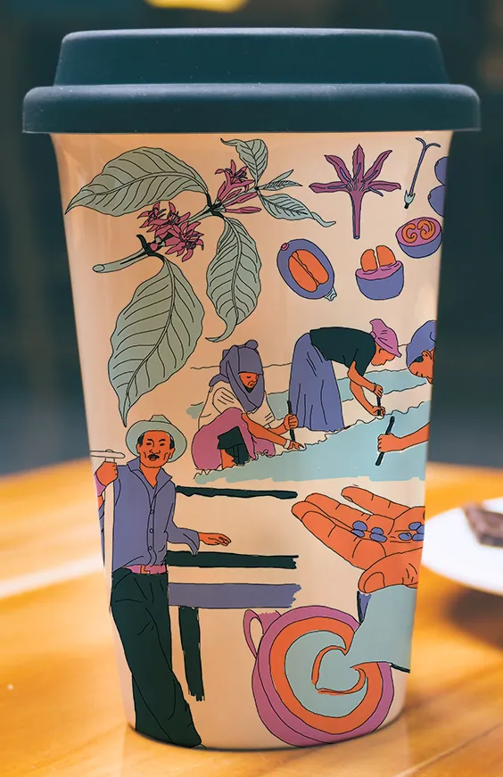
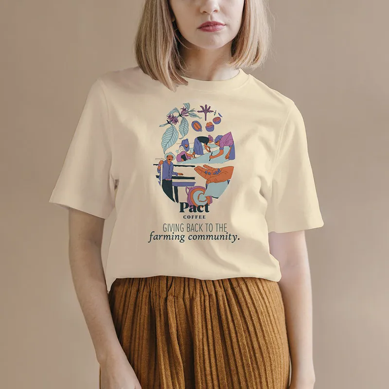
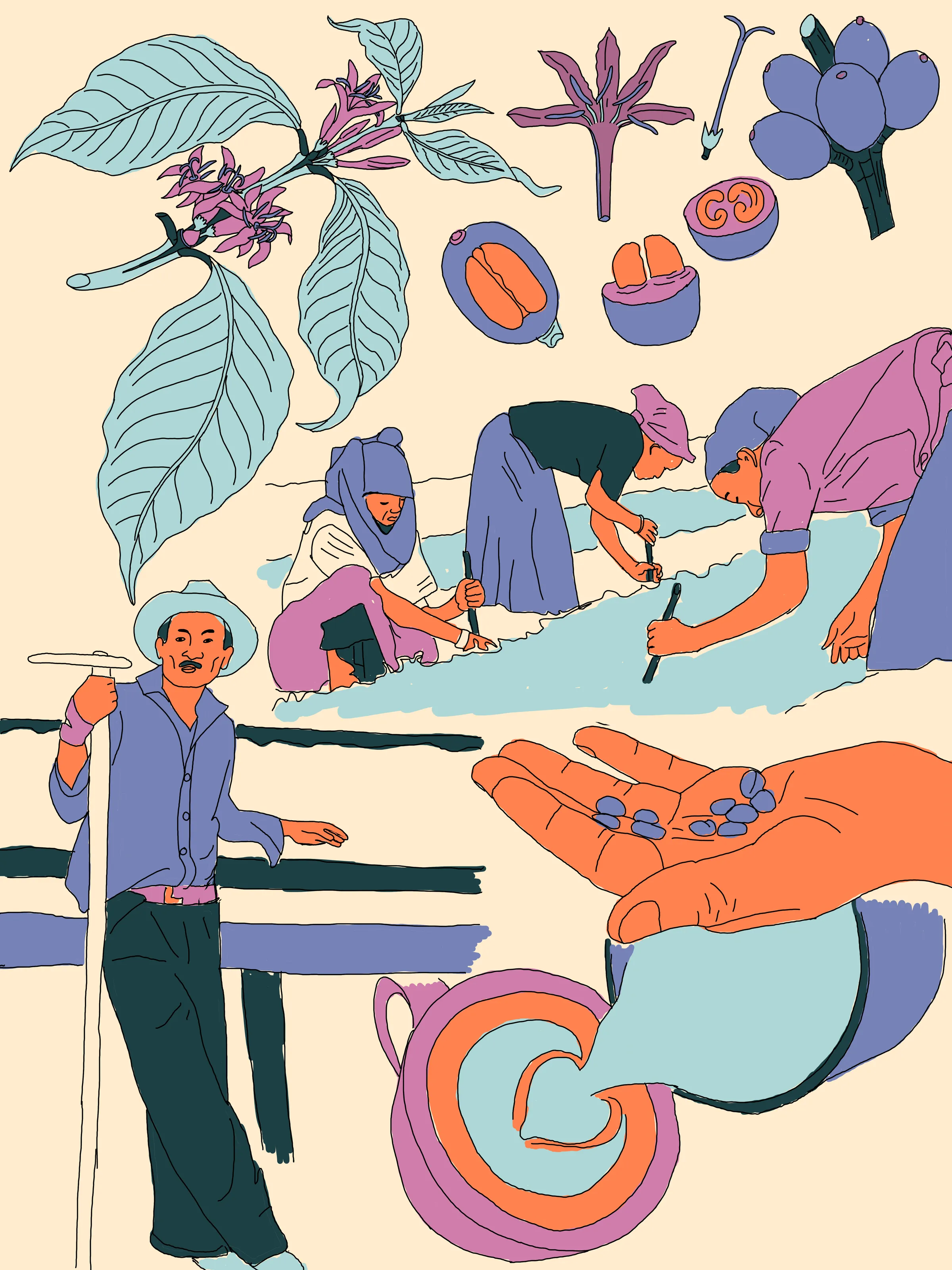
The whole Pact Coffee campaign hangs off one illustration. Farmers pick and sort coffee cherries at the water’s edge, a flowering branch runs through them, the cherries appear whole and in cross-section, and there’s a cup of coffee at the end of it. All of it drawn in orange, periwinkle and lilac on cream.
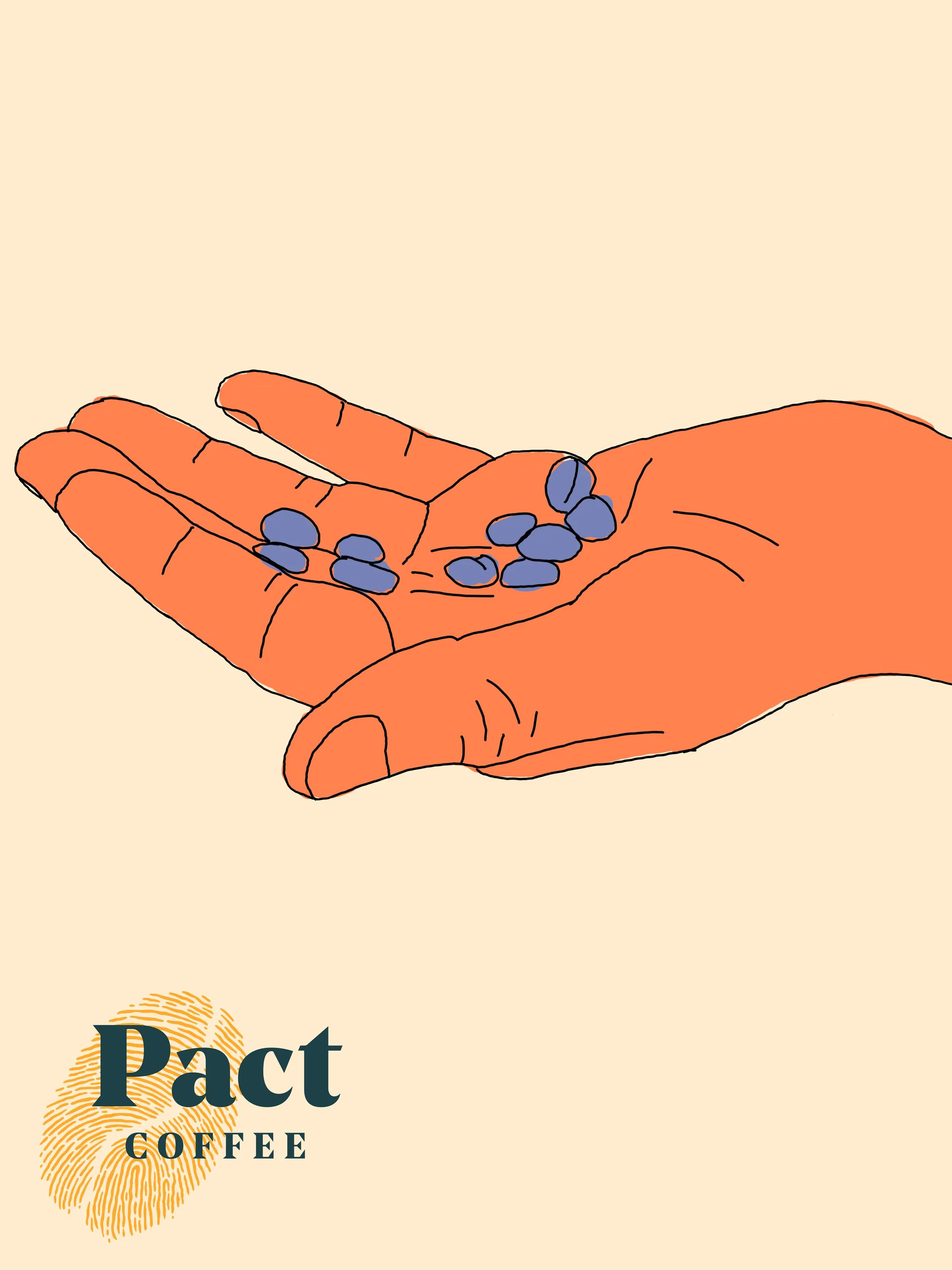
From there it goes onto a canvas tote, a wrapped travel cup, a cream t-shirt and a poster that sets the scene in an oval vignette above the line ‘Giving back to the farming community’. There’s a quieter cut as well, pared back to one open hand holding a few beans over the dark teal wordmark and its gold fingerprint.
 View larger
 View larger
Think Like A Dyslexic
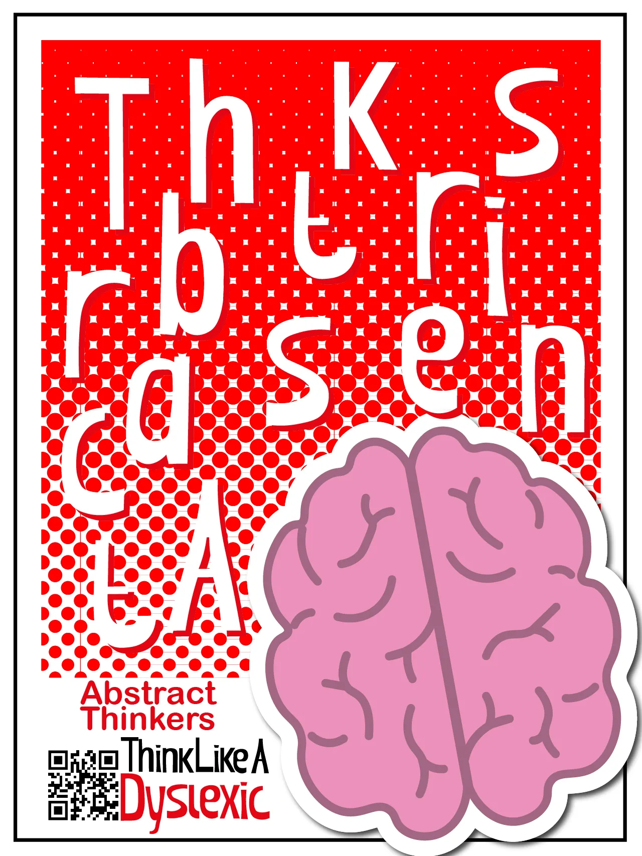
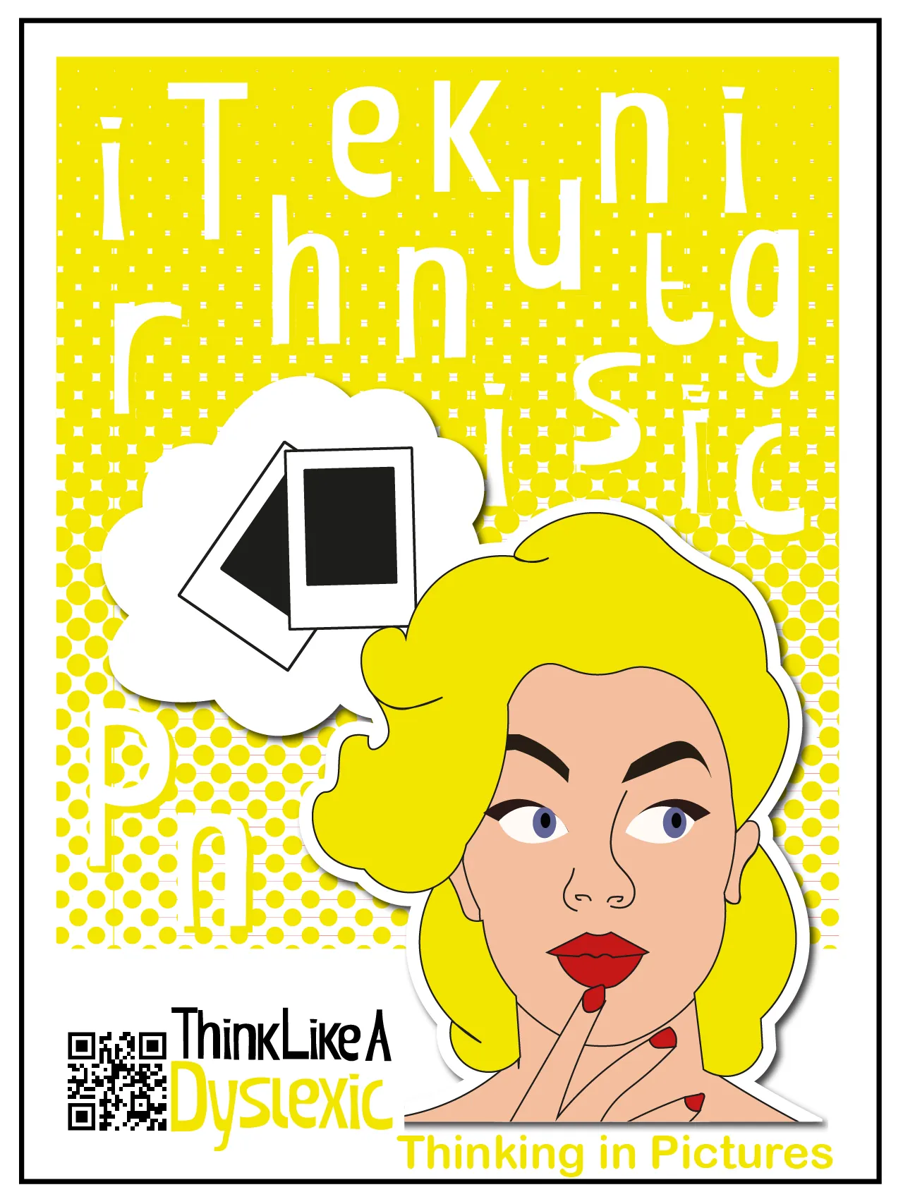
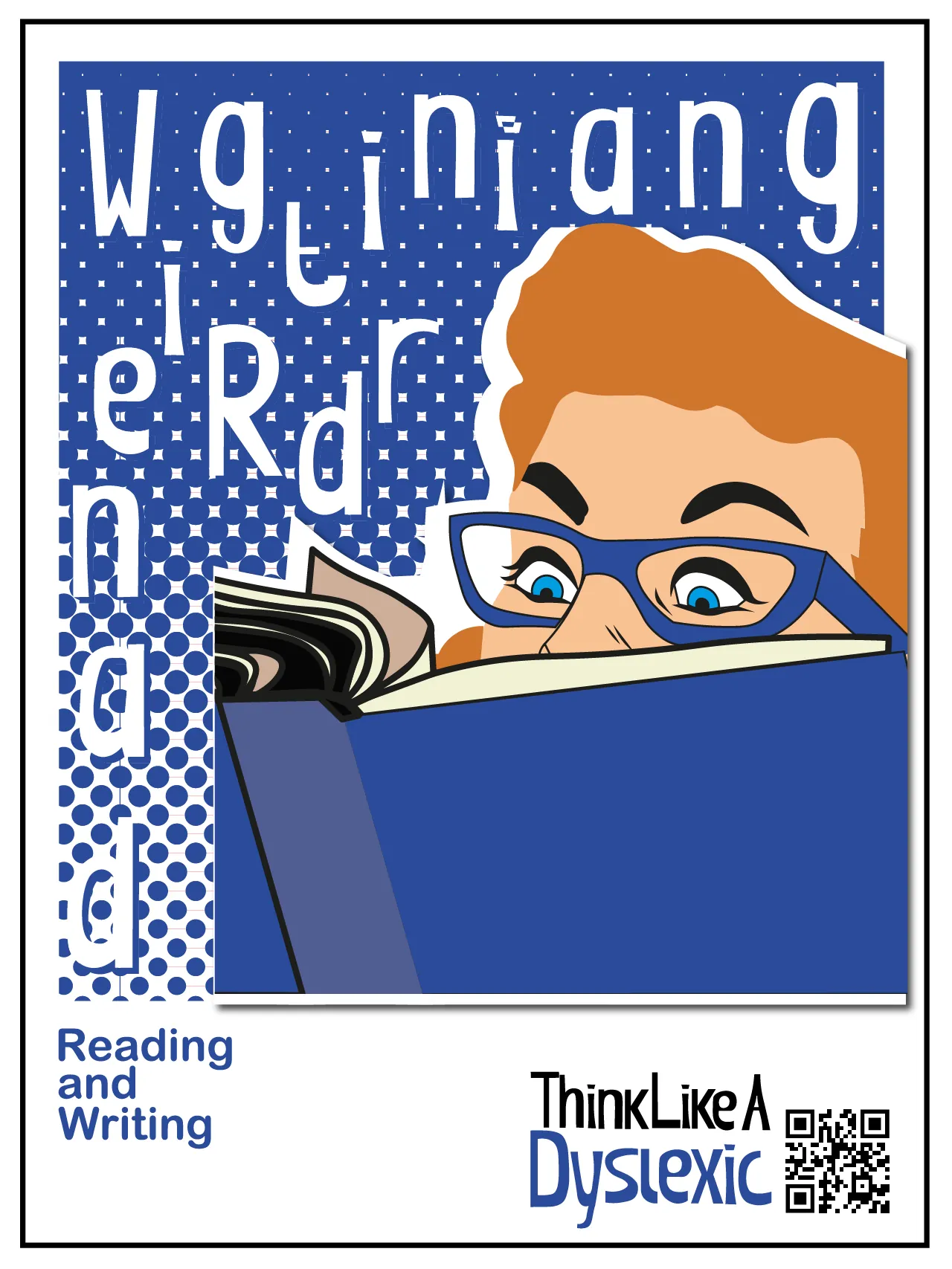
Eight posters for the Think Like A Dyslexic campaign. Each one takes a single trait and gives it one pop-art image on a halftone field. Memory gets a pair of eyes shedding a tear. Direction gets a pointing hand. Every sheet carries the campaign logo and a QR code in the same place.
The letters of each title are scrambled and scattered across the top of the sheet, so the type does to the reader a little of what the campaign is describing. All eight keep the same portrait format, halftone treatment and type hierarchy, so the set still reads as one family when it goes up on a wall.
 View larger
 View larger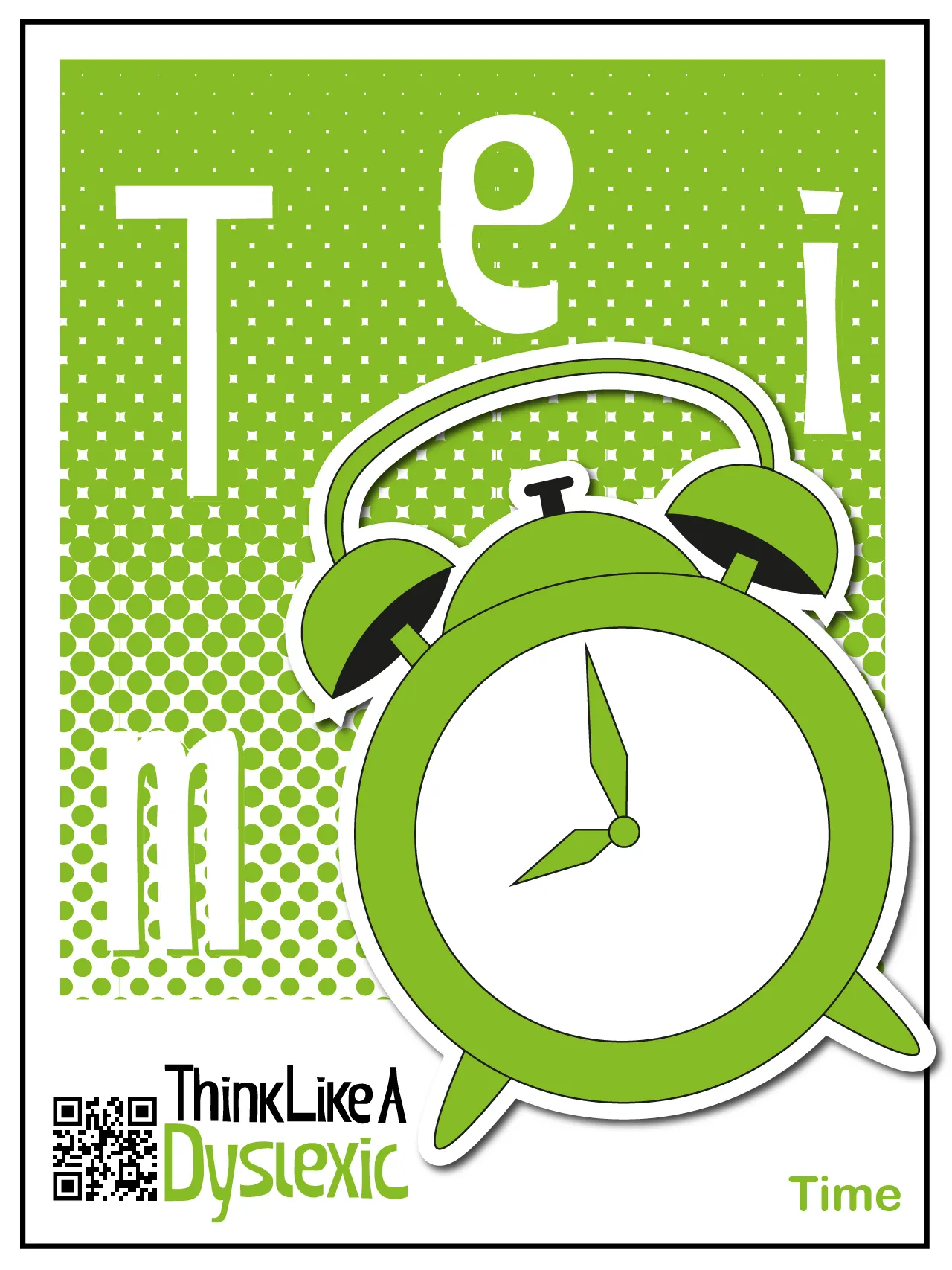


Rooted
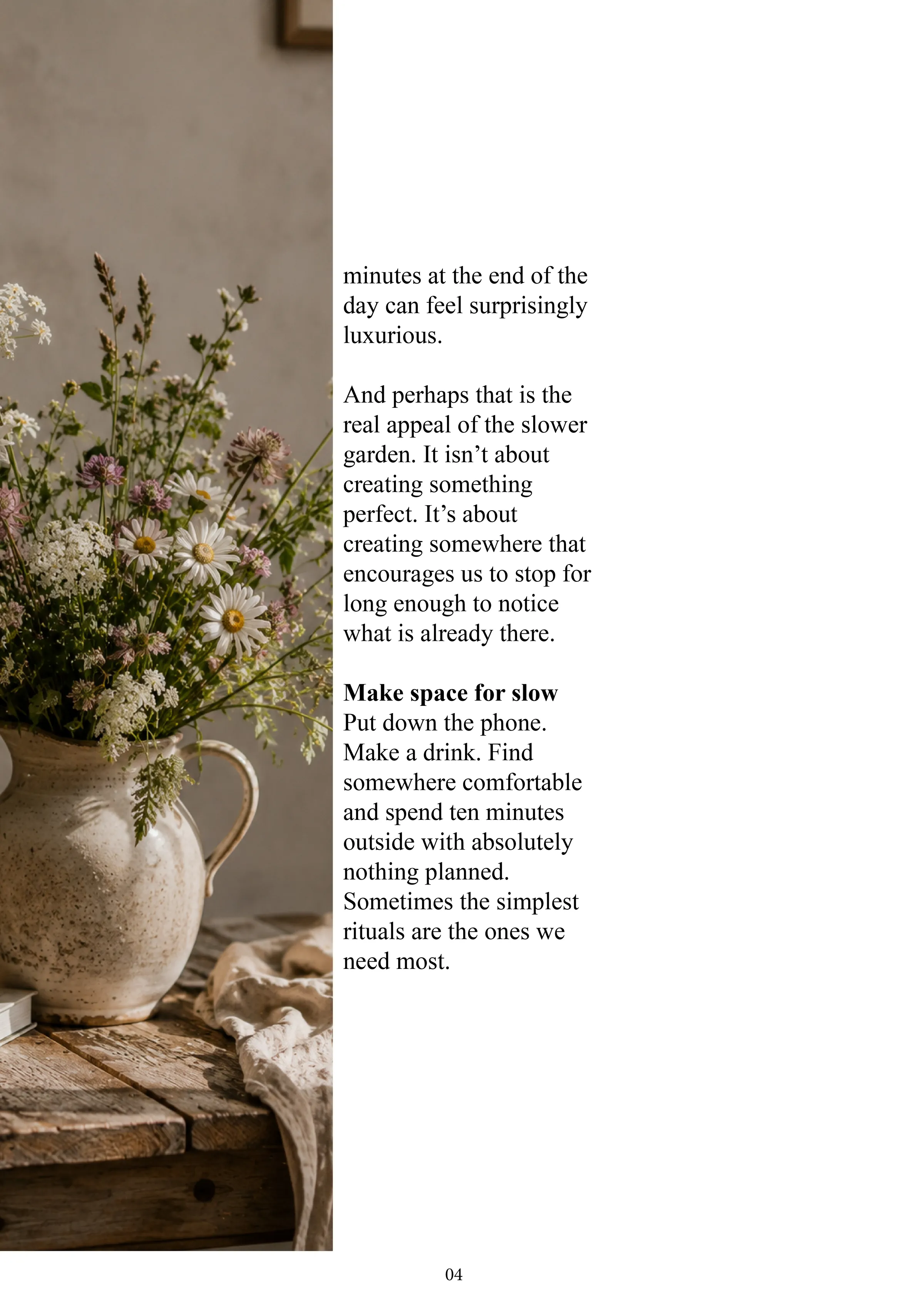
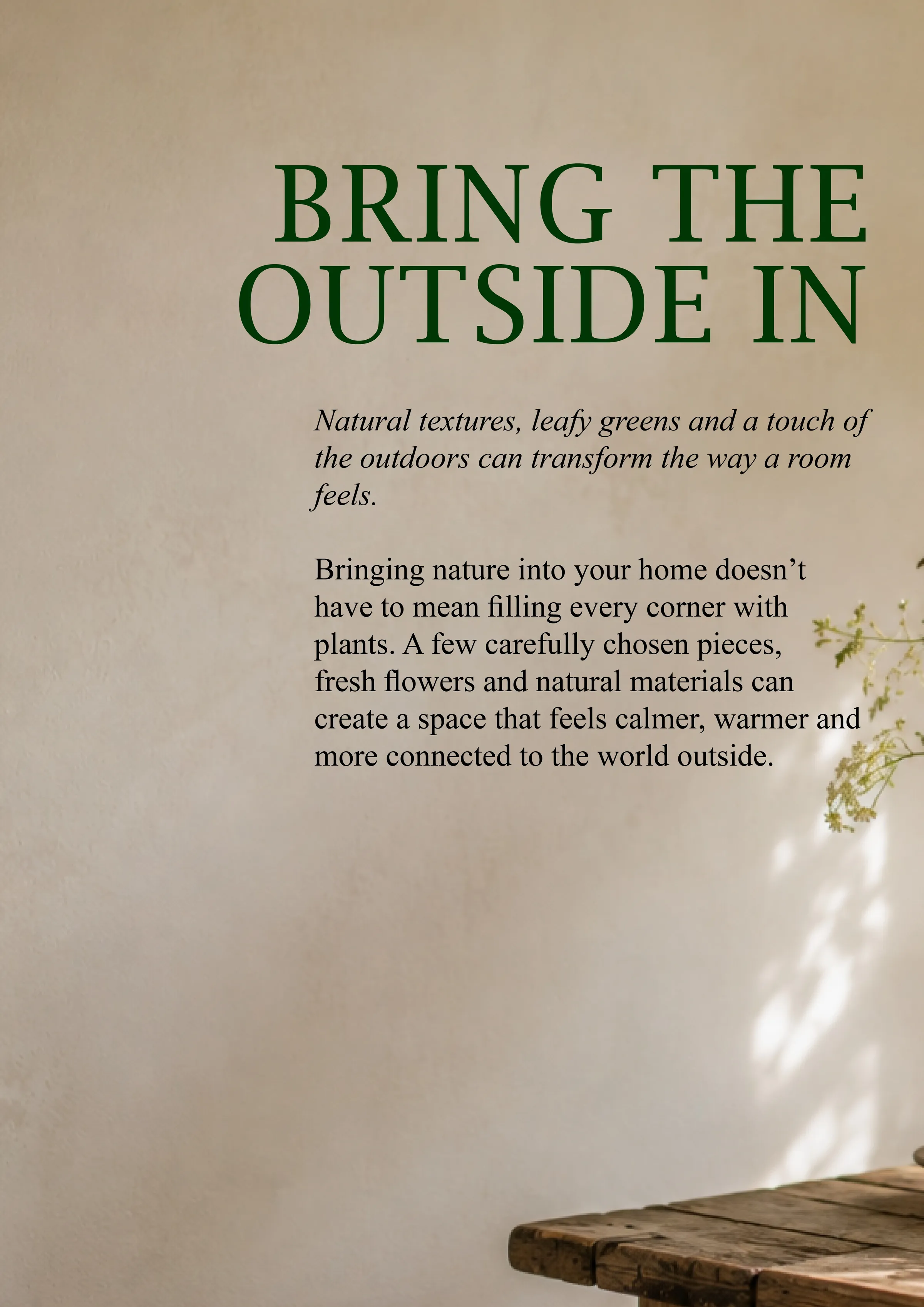
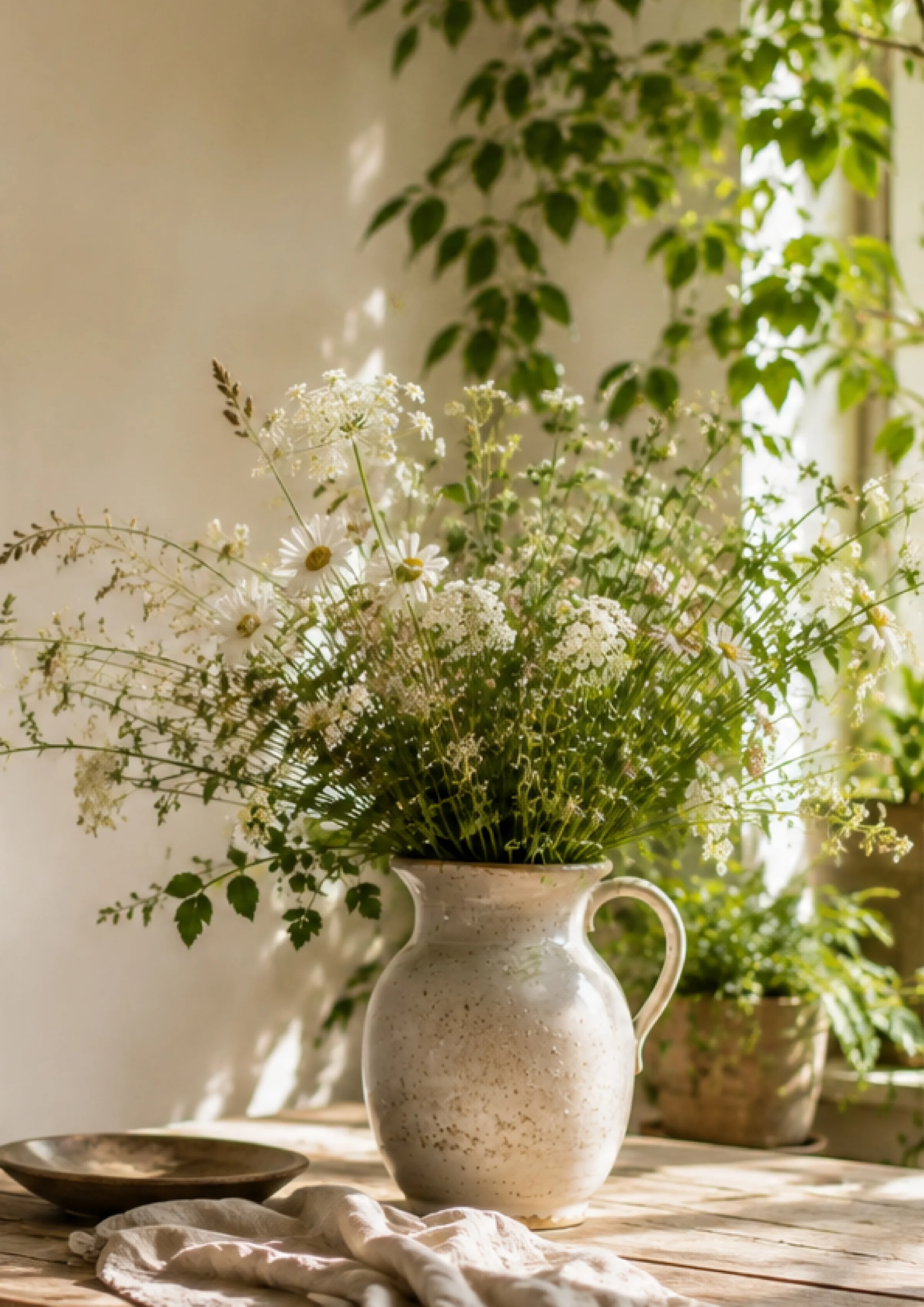
Rooted is a magazine about the slower life. Here’s the cover and five pages from the feature inside. The cover settles the type and the palette, then the pages work that same grid in different arrangements, from a text-led opener headed ‘Bring The Outside In’ to a full-bleed photograph of a stoneware jug of blossom on a linen table.
Every page balances image against column, with generous margins and a steady baseline, so the reading pace stays even from one turn to the next. A green pull-quote sits in the middle of the feature to give it a breath.
 View larger
 View larger
Something to put in people’s hands
Leaflets, posters, campaign artwork or a whole brand suite. Tell me what you need and where it has to work, and I’ll take it from there.
Get in touch