Infographics & Information Design
Process · Cycle · Timeline · Comparison
Infographic design and data visualisation. I take a process, a comparison or a set of numbers and give it a shape someone can follow on their own, without a slide deck and somebody talking over it.
What’s in the set
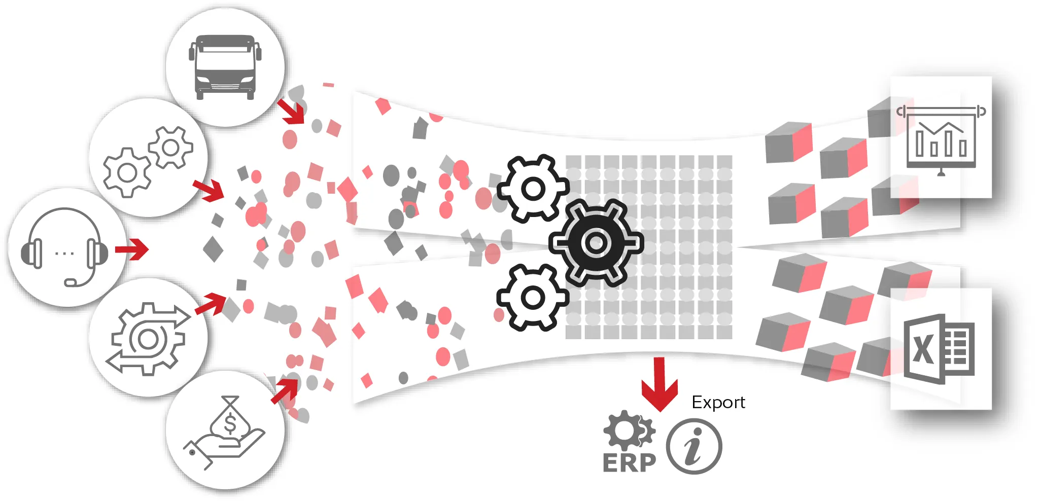
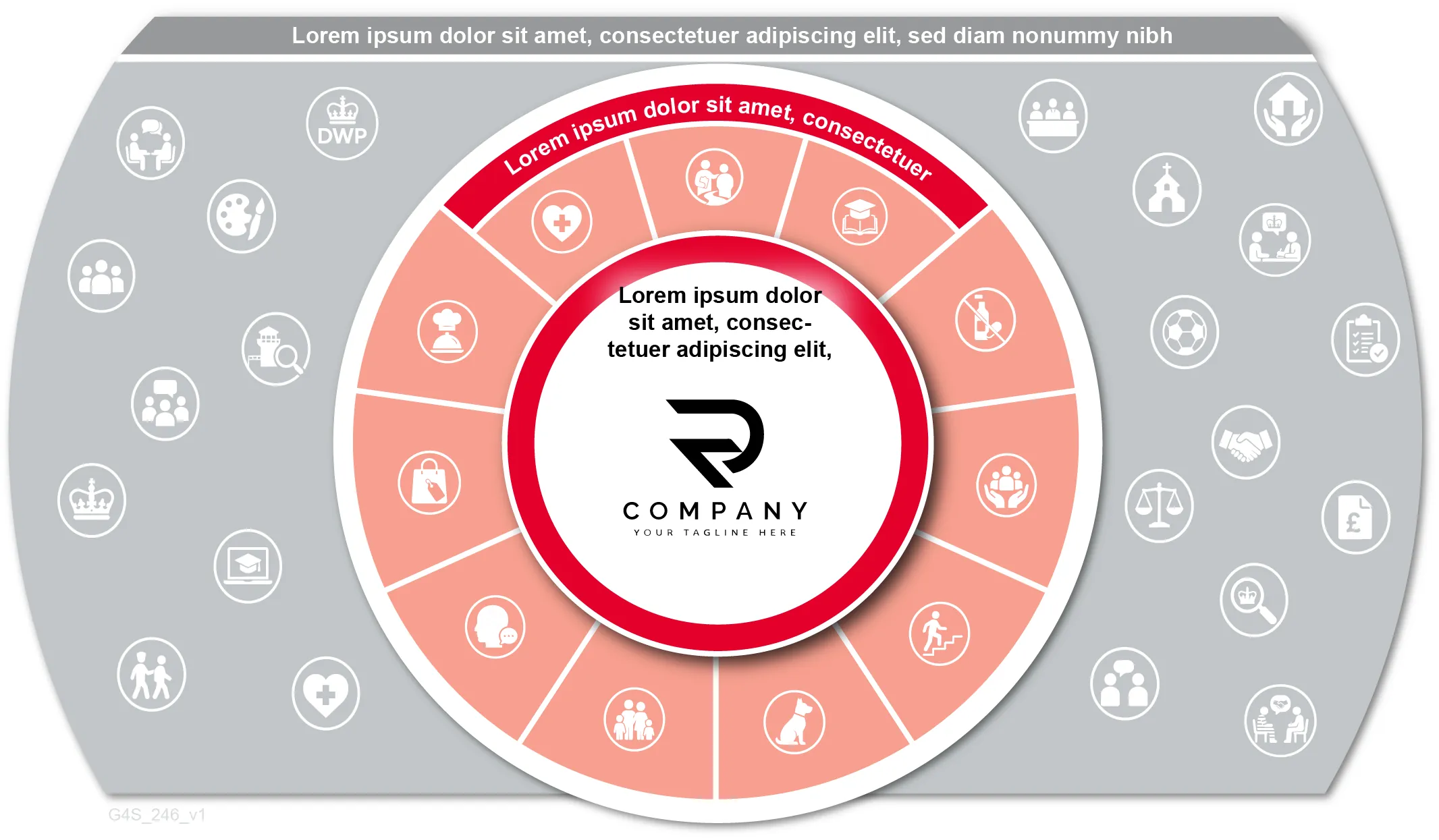
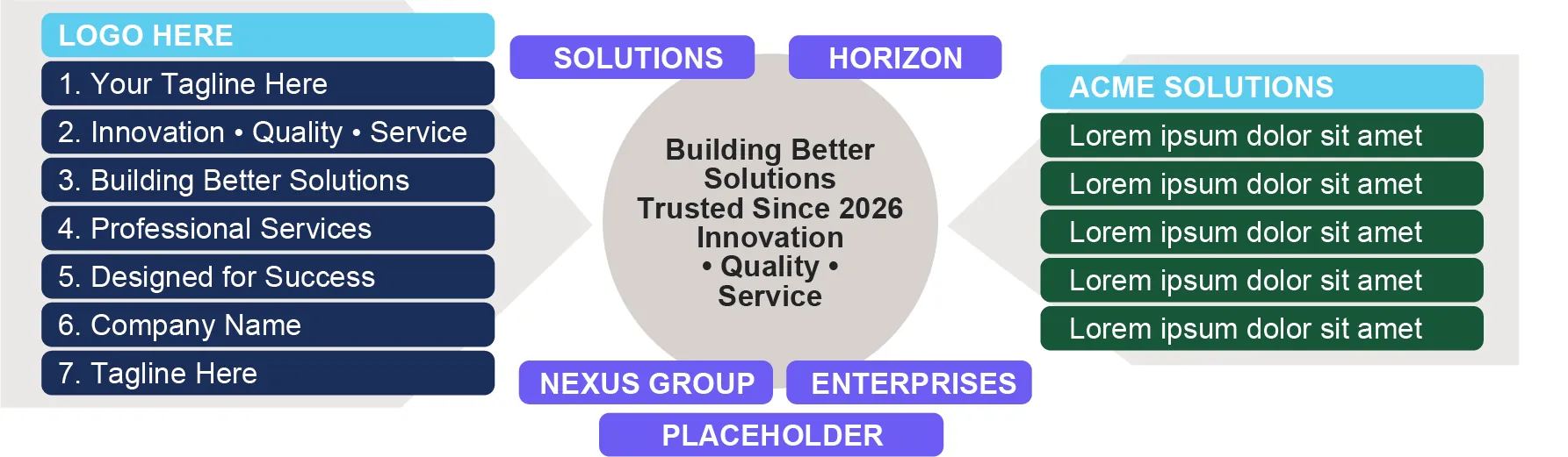
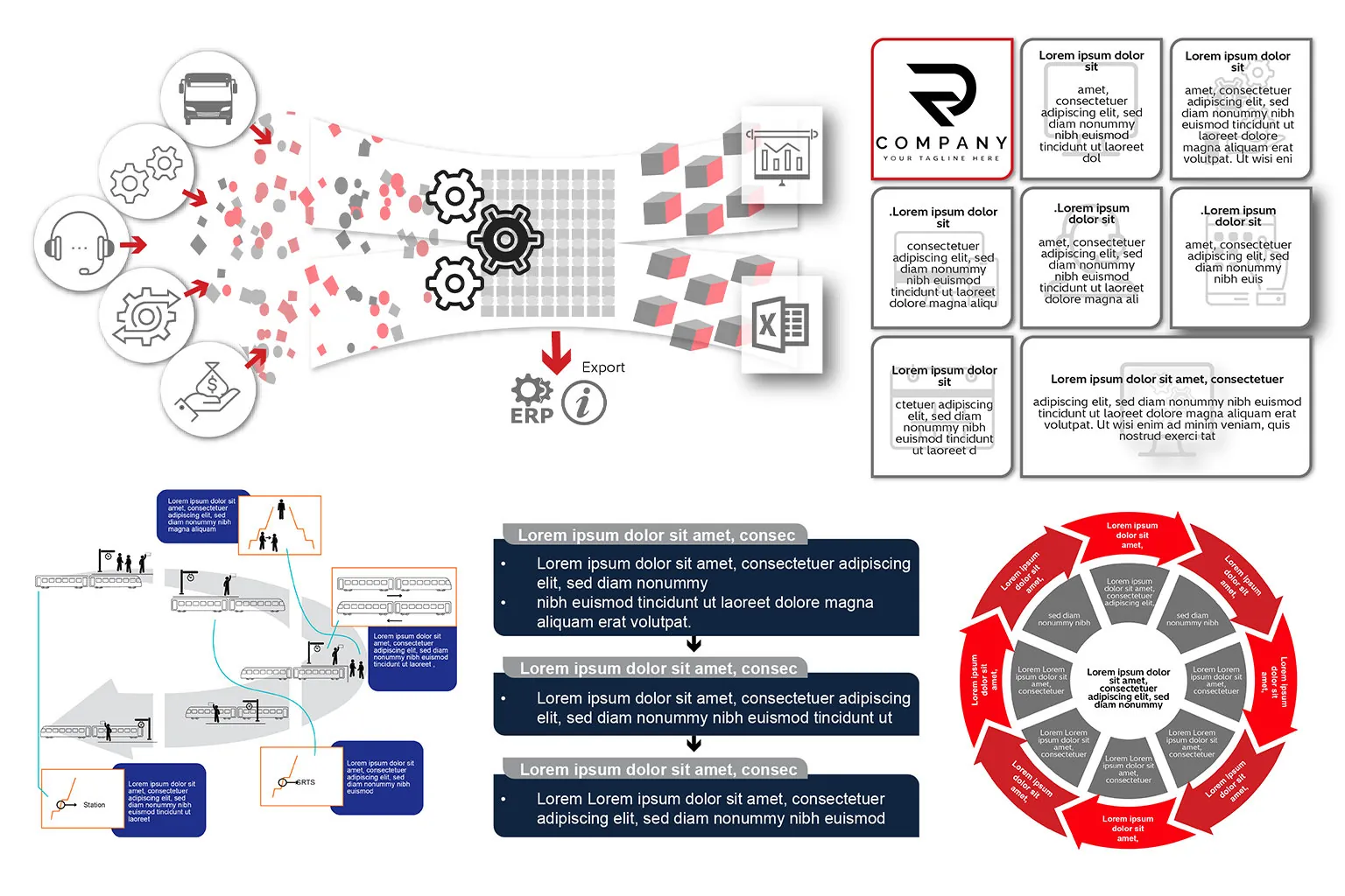
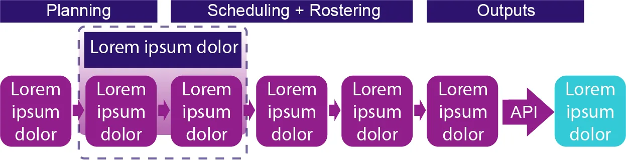
A run of infographics made to be read quickly and understood the first time. There are step-by-step flows, a services wheel with rings of icons around a central logo, an eight-arrow cycle in red and grey, and a data pipeline that takes vehicle inputs through a set of gears and out as finished reports.
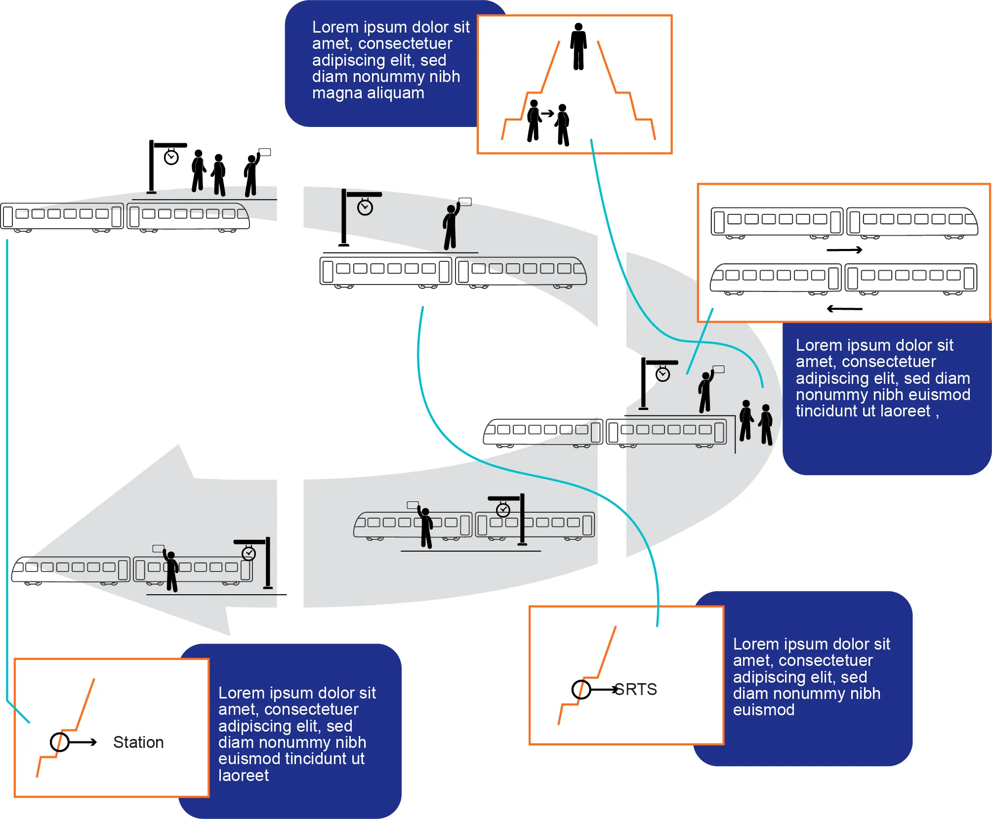
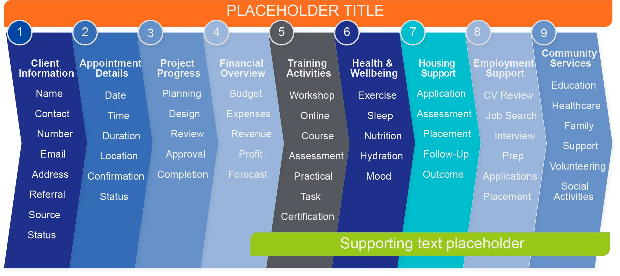
Alongside those sit a nine-column service breakdown banded in blues, a cyan meetings table grouped by how often each one comes round, a day-in-the-life timeline and a rail operations cycle with trains and platform staff. The last board gathers several of the layouts in one place.
 View larger
Shape first
Every piece starts with the shape of the information rather than the decoration: a sequence, a cycle, a comparison, a grid. Colour goes in afterwards to separate the steps and group like with like, never just to fill space.
 View larger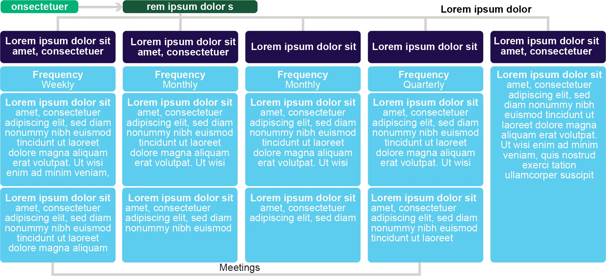
Built to be read
Formats run from a single-line timeline to a nine-column breakdown, and the aim doesn’t change with the format. One clear way in, one route through, and labels short enough to read without stopping.
 View larger
Make the complicated clear
If you’ve got a process, a comparison or a set of numbers that needs explaining, send it over. I’ll give it a shape people will actually read.
Get in touch